coopedl’s blog

Another amazing bgsu blog

Project 4-Trade Show Display

Filed under: VCT 3040 — coopedl at 7:32 am on Thursday, March 31, 2011

For my trade show display, I’m going to make a display for Absolut Vodka for an alcohol and spirits tradeshow.  The existing display that I chose to resemble is the one for Florida Crystals.

Absolut vodka is advertised as a classy liquor with the logo of “Every drink is an exceptional Experience.” With the display I found for Florida Crystal, I like how it has a welcoming atmosphere to come in and have a seat and try some drinks. My display will have a little bar area with a bar tender who can mix up small samples of mixed drinks with different kinds of liquors. The images on the walls will be of the fresh ingredients found in the drinks and the logo. Below are some images that I will use for ideas for my display.

Below are the thumbnails I drew up…


Assignment5-3.29.11

Filed under: VCT 4600 — coopedl at 6:06 pm on Tuesday, March 29, 2011

I used the clarity slider (Sliding it to the right) to increase the amount of snap in this image.

I used the clarity slider (Sliding it to the right) to decrease the snapiness of this photo and make it smoother.

I used the crop tool for this image.

I adjusted the exposure of this image.

I also adjusted the exposure of this image.

I used the Fill Light slider to adjust the amount of fill light in this image by sliding it to the right.

I straightened this image with the straighten tool.

I adjusted the contrast in this image by dragging the highlights and lights, darks and shadows sliders in the Parametric curve.

I adjusted the contrast in this image using the Point Curve in the Tone Curve icon.

I adjusted the white balance using the auto white balance drop down window and the white balance tool.

Assignment5-March22,2011

Filed under: VCT 4600 — coopedl at 7:27 pm on Tuesday, March 22, 2011

Part 1: Make HDR


Part 2: Content Aware

Before- After-

Part 3: Make a Sunny Day

Before-After-

Cooper_Project4

Filed under: VCT 4600 — coopedl at 3:30 pm on Tuesday, March 22, 2011

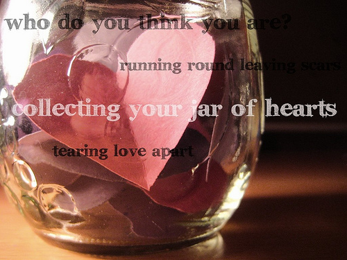
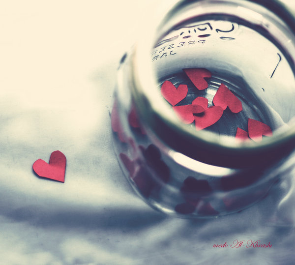
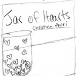
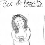
For my CD insert, the song i’m going to design for is Jar of Hearts by Christina Perri. The song is about a serial heartbreaker that the artist once dated.  A boy who had a jar of hearts from all the girls whose hearts he’d broken. My favorite lyrics are ‘Who do you think you are, running around leaving scars, collecting your jar of hearts, and tearing love apart.’  I feel like this song is empowering to girls who have been heartbroken before because it’s expressing the anger towards the boy and it stands up to them. More lyrics that I really like are, ‘You’re gonna catch a cold From the ice inside your soul, So don’t come back for me. Who do you think you are. ‘ These words give girls who listen to it the strength to be angry and help move on from that passed love. Below is the link to the music video on youtube.

http://www.youtube.com/watch?v=8v_4O44sfjM

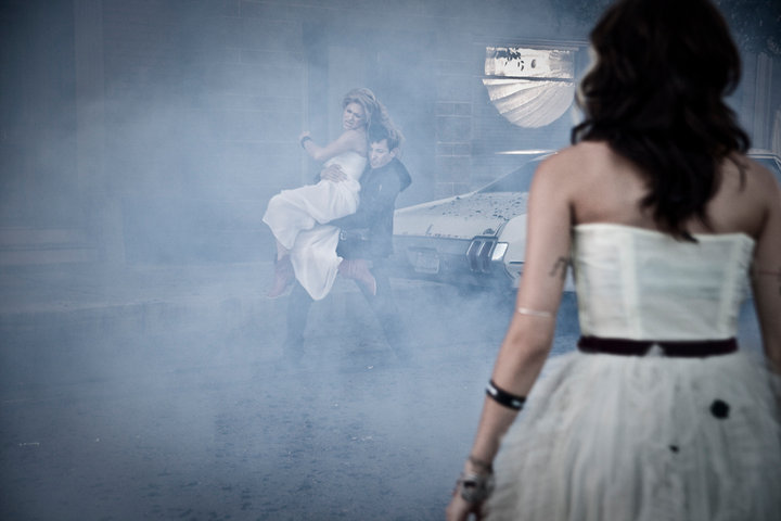
I, personally, think the video is very good and goesalong with the song very well. It shows the meaning of the song and it is very deep. I think I will be using the video for some inspiration on my design for the CD insert. The term ‘Jar of hearts’ represents all the broken hearts of the girls who the guy has been with and hurt. He keeps going around breaking hearts and being careless with girls and Christina is telling him it’s not fair for him to do this and then come back to her expecting her to be there for him. Even though the song is clearly a little sad because the girl is heartbroken, it’s also empowering because it says ‘who do you think you are’ to the boy and it’s saying that he can’t keep hurting people the way he is. I would like to represent this song as a little sad and down, but also strengthening for the heartbroken girls to stand up to the heartbreaking men.

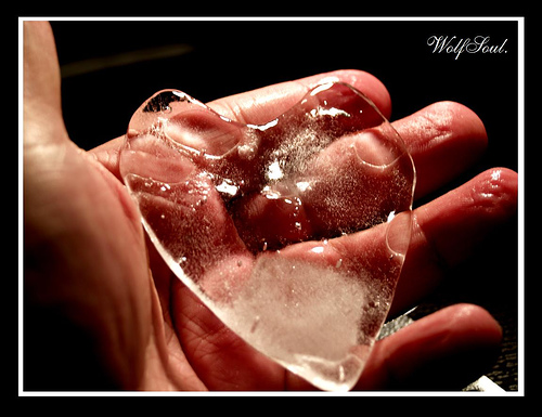
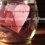
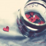
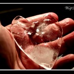
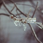
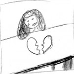
Here are some images I have found that I think represent this song for this project:

I plan on using dark gloomy colors for the most part. Maybe all black and white and some red. Each panel might have a different image with different lyrics of the song written across it or somewhere on the panel. Another option is to have the whole song written on the insert, with different verses on each panel.

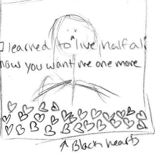
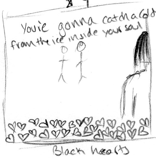
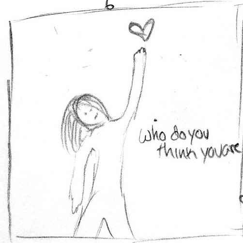
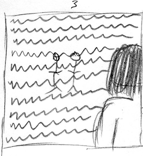
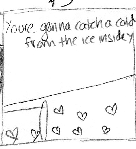
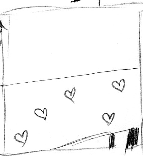
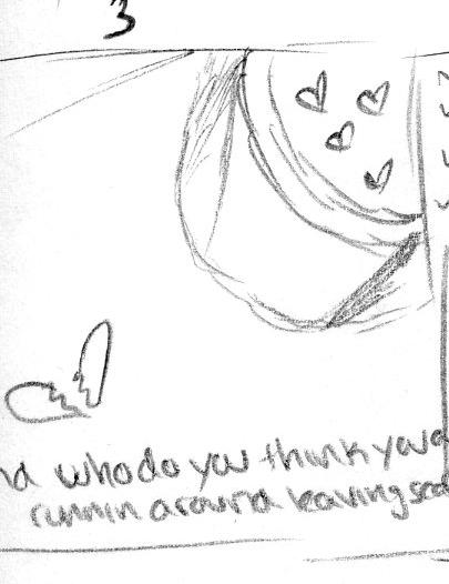
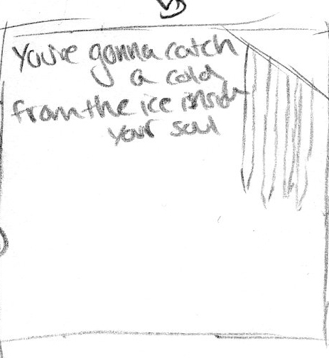
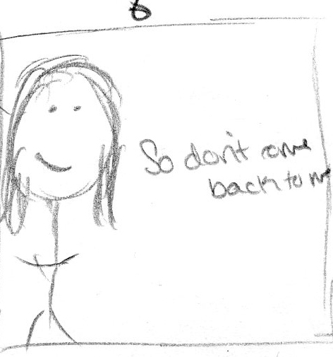
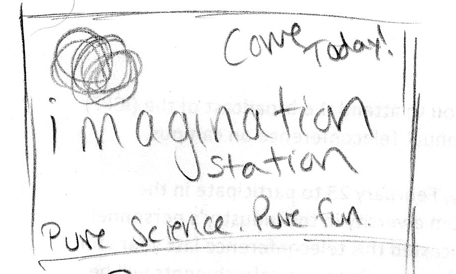
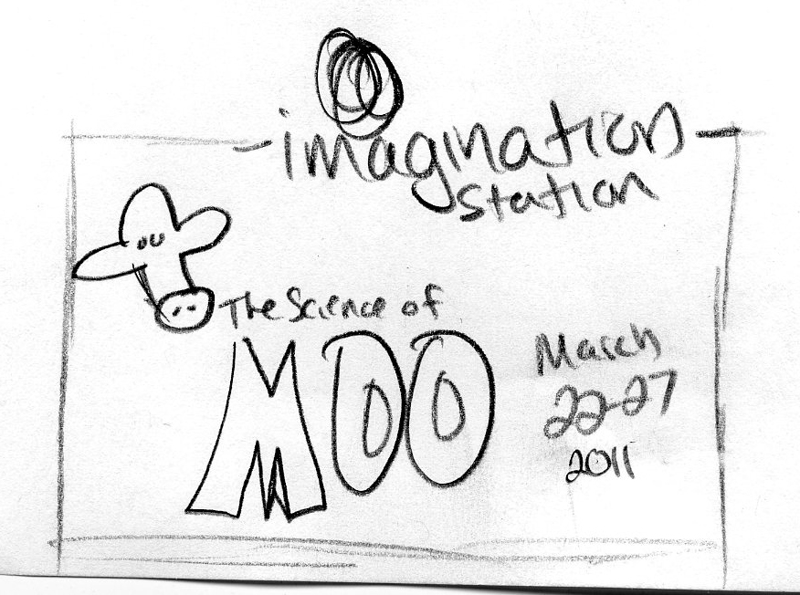
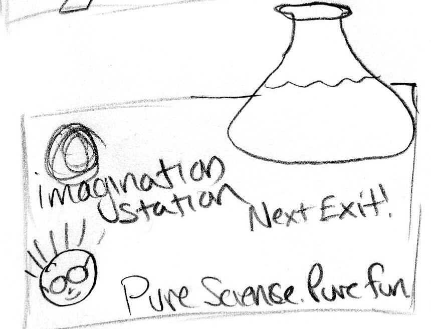
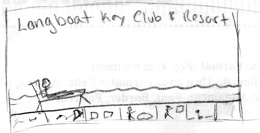
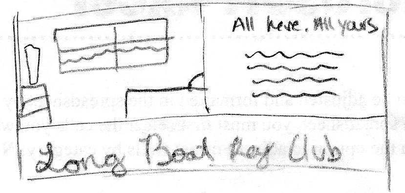
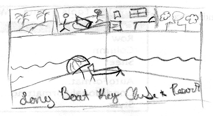
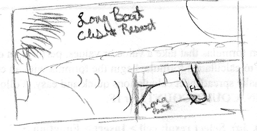
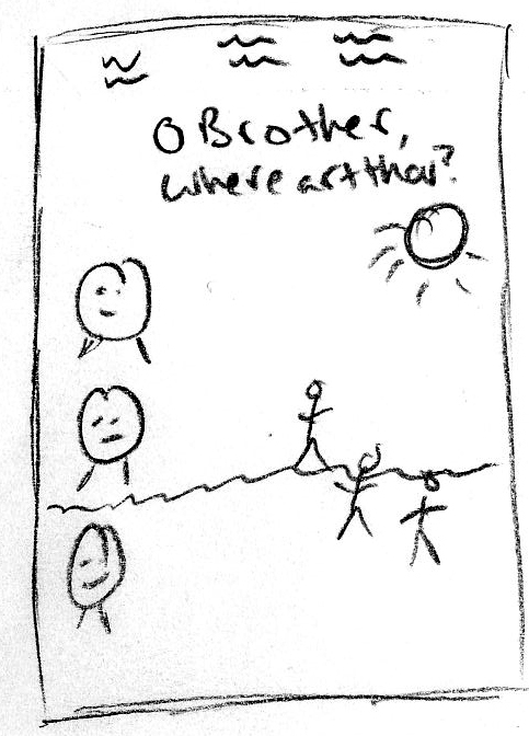
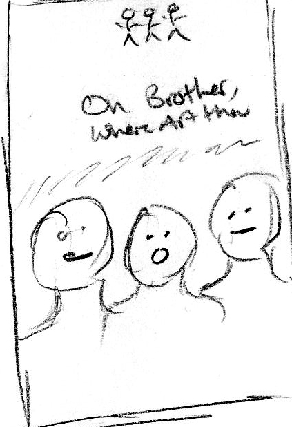
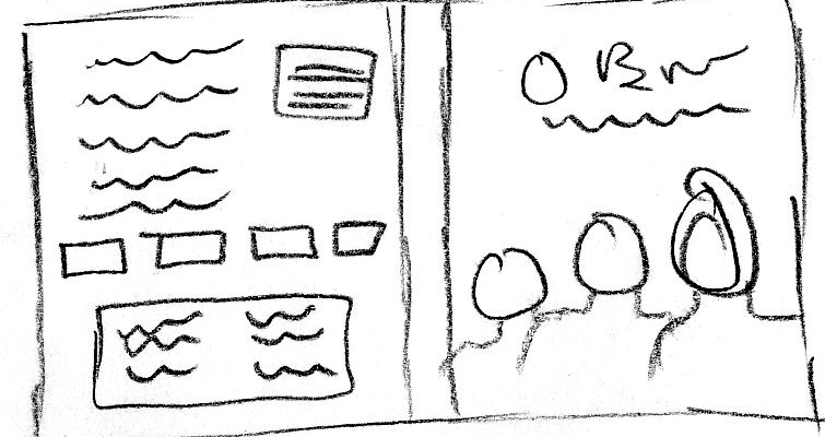
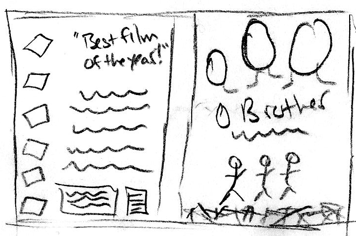
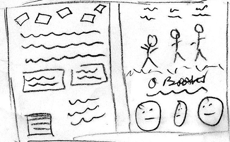
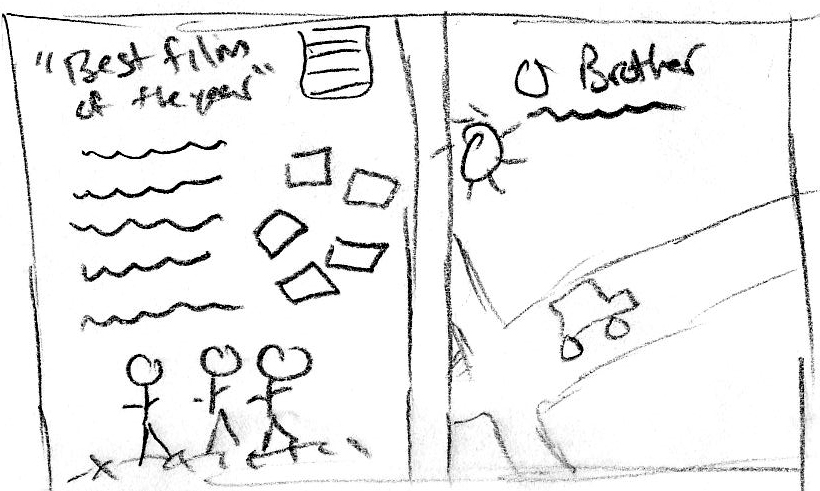
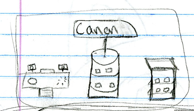
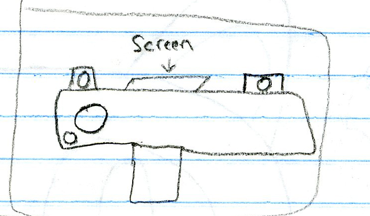
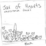
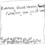
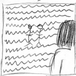
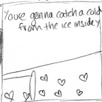
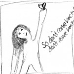
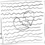
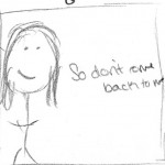
Below are the thumbnails I sketched for the panels of my CD insert.

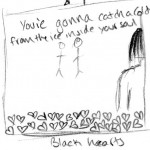
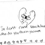
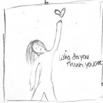
My first Idea is to tell a story through the song lyrics from one panel to the next. At first the hearts are all black and broken and the lyrics from the song are the sad ones like, ‘I learned to live half a life, now you want more’ and ‘you’re gonna catch a cold, from the ice inside your soul’. Then the lyrics are more empowering and the hearts turn back to red with lyrics like ‘So don’t come back to me, who do you think you are, and  ‘running around leaving scars, collecting your jar of hearts.’ The images become brighter and less depressing. The final panel has a girl holding her heart up in the air and the lyrics ‘Who do you think you are’.


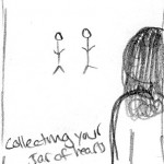
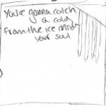
My second idea, is to show the jar of hearts on a table  full of broken, black hearts. The next panel will be an image of a girl looking really sad, maybe sitting at that same table with a broken heart in front of her. The third panel will have all the lyrics across the page with a faded image of a girl looking at the boy who broke her heart (this is an image from the music video). The fourth and fifth panels will show the jar knocked over and the hearts spilling out of it, scattered across the two panels and the lyrics ‘You’re gonna catch a cold from the ice inside your soul’. Then the last panel will be the girl reaching up with her fixed heart in her hand and the lyrics ‘So don’t come back to me, don’t come back at all.’

The third idea is a little bit of a story, but also just images expressing the lyrics.
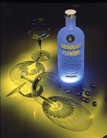
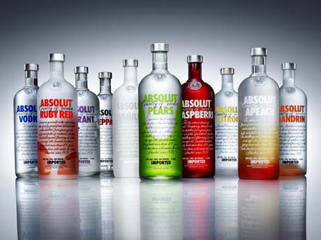
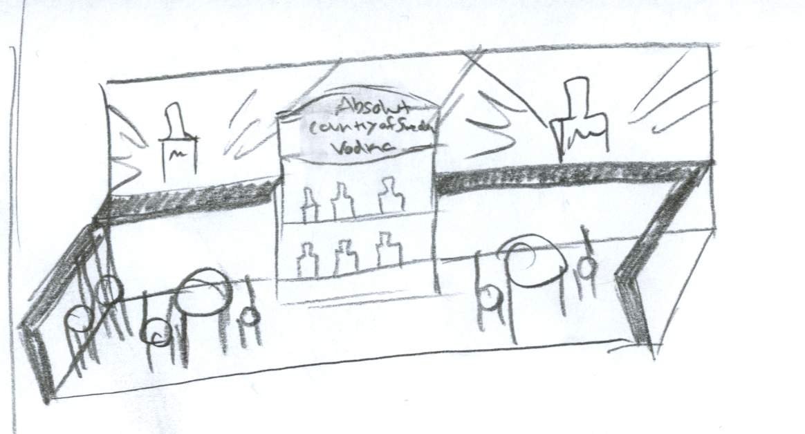
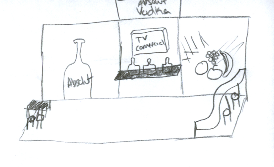
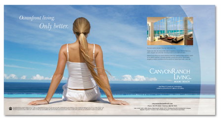
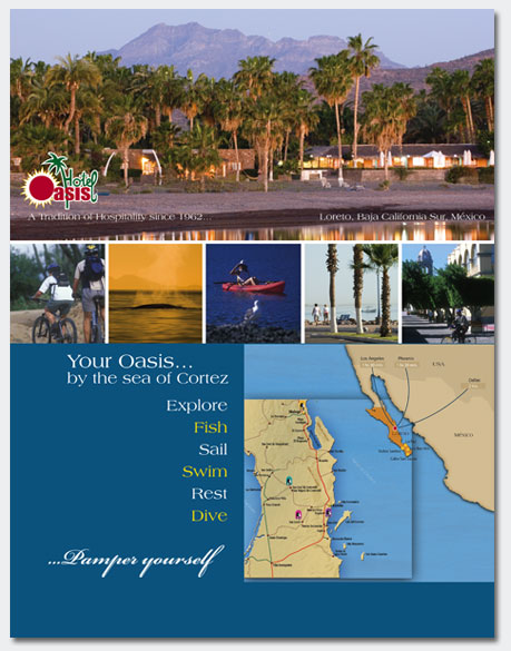
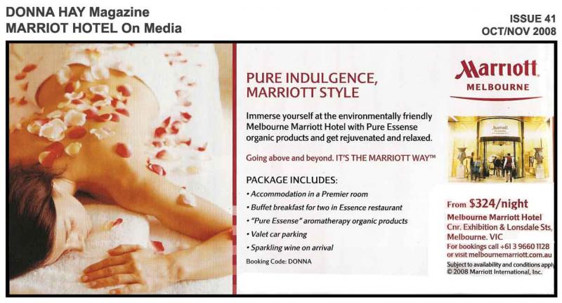
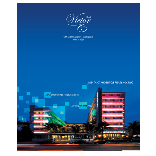
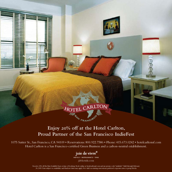
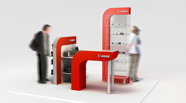
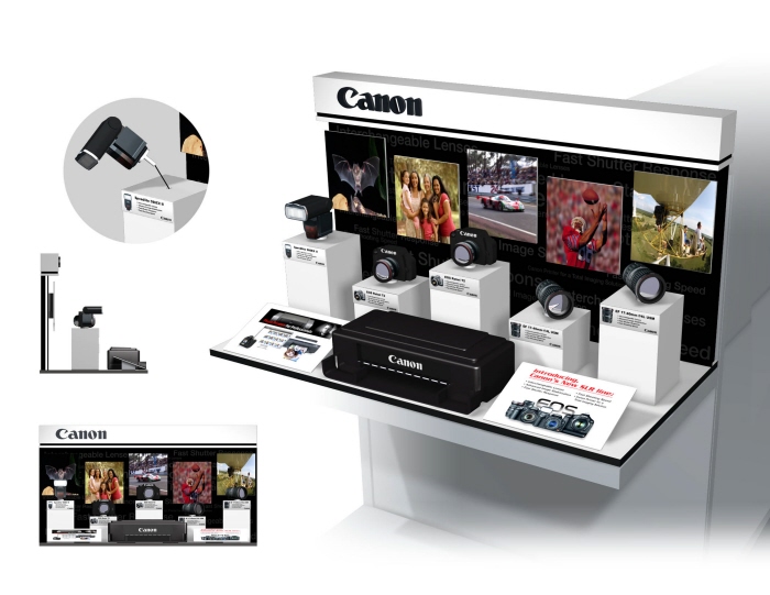
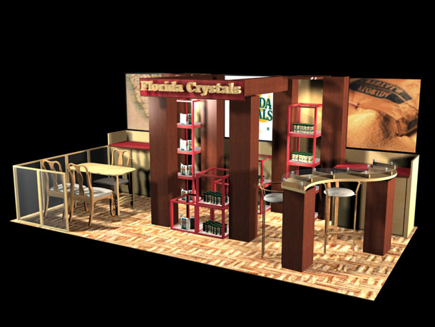
 

Cooper_Proj3

Filed under: VCT 3040 — coopedl at 6:52 pm on Wednesday, March 16, 2011

For my billboard, the company I am choosing is the Imagination Station. Imagination Station is a science exhibition directed towards people of all ages who are looking for an exciting educational adventure in the world of science. The billboards I design will be directed towards parents and families. I am going to try to attract people to the exhibit as they drive by. Catching their eye with bright colors and large colorful text. Pictures of happy children and/or families will also attract parents and intrigue them into looking into what the Imagination Station offers.  My different billboards will advertise the special exhibits and programs at Imagination Station such as The Big Dig, The Science of Moo and the Summer Camps.


Below are some images I have found online that represent ideas I have for my billboard designs.

There are not many images online of the actual Imagination Station, but I will use a lot of colors and text to really make my billboard stand out.


Below are the thumbnails I drew up…

Cooper_Project3

Filed under: VCT 4600 — coopedl at 2:00 pm on Tuesday, March 1, 2011

For project 3, I am going to make a 2-page spread Ad for a hotel. I am going down to Florida for Spring Break, staying in a nice hotel on the beach (Long Boat Key Club & Resort), so I will be using most of my own photographs for this assignment. Below are some pictures of other magazine ads for hotels and spas.

My ad, like most hotel ads, will show all the different areas that the hotel offers. The golf course, tennis courts, spa, lobby, pool and beach. I want to represent the hotel as a classy, fancy place more for adults than family. I want to show all the relaxing places for the guests and show how enjoyable the time can be.  The website for the hotel is www.longboatkeyclub.com and this is where I will be getting most of my ideas for the Ad.

Visually, the colors will be soft and gentle so make the viewer feel relaxed just by looking at the ad. I am visioning a larger background image of the ocean which is the view from the hotel rooms. This image might be a panoramic photo. Then, I’ll show the different areas across the bottom of the page in smaller images. The font with me a script font to represent the upscale atmosphere of the hotel.  Below are some thumbnails I drew up for my layout of my ad.

Also, I have added my half size drawings of the two designs that I like the best and will most likely use.

Cooper_Assignment 4

Filed under: VCT 4600 — coopedl at 8:38 pm on Tuesday, February 22, 2011

I used the quick selection tool to select certain parts of the police car photo and copied them into the photo of the red chevy. I then used the free transform tool, perspective, distort, skew and warp tools to make the image come together. I also used black and white adjustment layer to change the color of the red car to black.

Cooper_Proj2

Filed under: VCT 4600 — coopedl at 3:03 pm on Tuesday, February 22, 2011

For my movie poster and DVD cover, I chose the movie ‘Oh Brother, Where art Thou’. It’s about 3 escaped convicts in search for a hidden treasure while a relentless law man pursues them.  It stars George Clooney, John Turturro and Tim Blake Nelson. It’s based on Homer’s Odyssey and two main themes to the movie are ‘Sometimes, you have to loser your way to get back home’ and ‘They have a plan, but not a clue’.  It’s an action filled comedy based in Mississippi in the 1930’s.

In the poster, I want to show that the movie is filled with adventure, but also comedy. I would like to use images of the characters running or in the middle of an action filled adventure along with images of the characters faces that show each of the characters personalities.  Colors in my poster will be browns and dull, natural colors because that is what the whole movie is portrayed as.  Below, I have added a few images from the movie and some images of posters for the movie.

The following are some thumbnails I drew for my poster as well as some thumbnails I drew for the DVD case.

Cooper_Proj2

Filed under: VCT 3040 — coopedl at 8:33 am on Thursday, February 17, 2011

For Project 2, I chose the brand Canon and the products I will display are Camera bodies, Flashes and Lenses. I chose this because this product is something I deal with often and felt I would most enjoy designing. Canon has been around since the 1930’s in Tokyo, Japan.  Canon is a manufacturer of imaging products such as printers, scanners, binoculars, compact digital cameras, film and digital SLR cameras, lenses and video camcorders. According to wikipedia, The Canon Group has an environmental charter which looks at ‘offering products with a lower environmental burden through improvements in resource efficiency, while eliminating anti-social activities that threaten the health and safety of mankind and the environment’.

For my display, I would like to use silver and red (which comes form the company logo) for the colors. I am picturing a modern display, that looks almost futuristic and high-tech.  Below are some images I have found of Canon displays. The fifth one is a photo of several displays from other products that I might take some ideas from. The stores that I was able to get to (walmart and meijer) do not have any camera displays other than cameras sitting on the counter tops with security wires connected to them. The sixth photo is a photo of how cameras are displayed in department stores. My display would be more for a specialty store like Best Buy or a store especially for digital cameras.

I want to convey the message that Canon is top of the line in cameras and their other digital equipment. Like I stated earlier, I want the display to be visually high-tech, sharp, clean and crisp. Canon is one of the leading manufacturers of imaging and optical products and I want to display to reflect that and look professional and reliable.

Below are the thumbnails I drew up for my display design.

Assignment 3 – Feb. 8, 2011

Filed under: VCT 4600 — coopedl at 8:27 pm on Tuesday, February 8, 2011

For the first image, I opened both pictures in two different layers. I moved the man to the front by dragging his layer to the top in the layers panel. I placed him to the left where I wanted him to be. I used the magnetic lasso tool to make a selection around him and then opened the refine edge dialog box. I chose ‘On Layer’ View, adjusted the ‘Smooth’ and ‘Feather’ sliders as well as the radius slider. I used the refine radius tool to make adjustments to get the image how I wanted it to look, then checked the ‘decontaminate colors’ box and adjusted that slider as I needed.

For part 2, I simply made a black and white adjustment layer over the original layer and used the eraser tool to erase the part of the image that I wanted to be in color.

For the panoramic image, I opened up photoshop, went to File…Automate…Photomerge and browsed through my computer for the files I wanted to merge together and photoshop connected the photos. I used the crop tool to crop out the corners and got this final image.

Next Page »